
Moofut Corny Corn Cheese Balls
CATEGORY: Food & FMCG
SOFTWARE: Adobe Photoshop, Illustrator
SERVICES: Brand Strategy, Packaging Design, Copywriting
CLIENT: Moofut
01. The Challenge
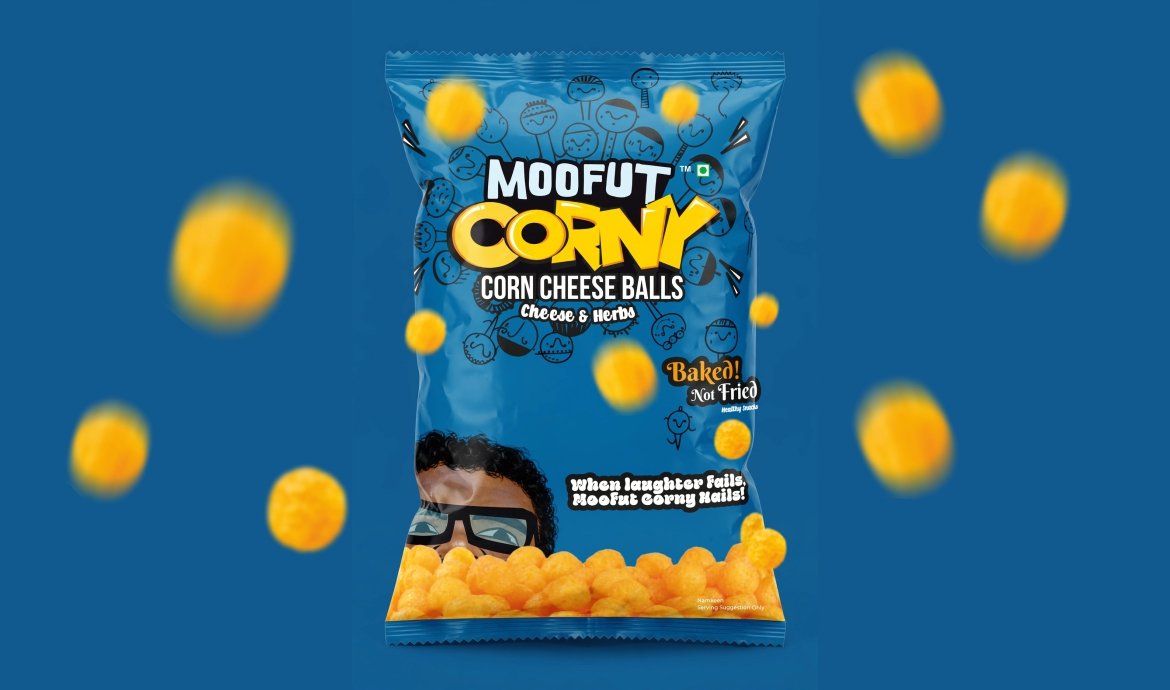
Moofut Corny needed packaging that could immediately communicate the product’s personality while still retaining the essential information expected from an FMCG food product. As a corn cheese balls snack, the design had to balance appetite appeal, flavour communication and a youthful brand character without becoming visually cluttered.
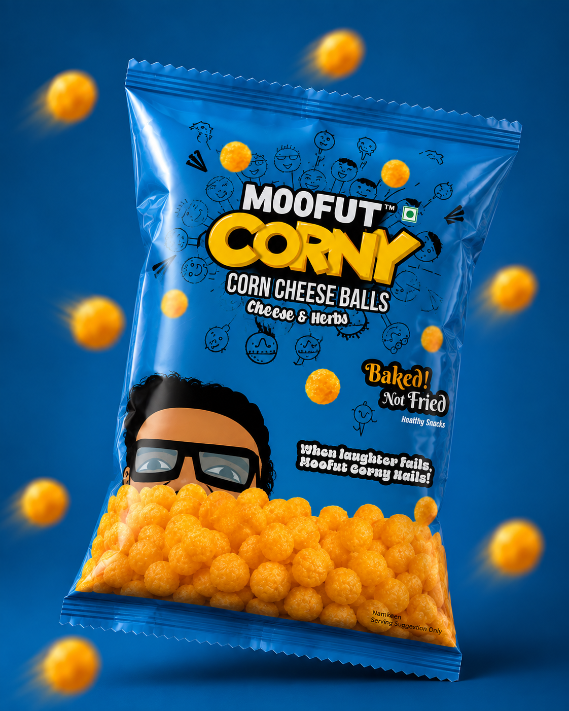
The packaging also needed to distinguish the product on a crowded snack shelf where bright colours, large product visuals and bold typography compete heavily for attention. At the same time, mandatory product information such as ingredients, nutritional values, allergen information, manufacturer details and regulatory declarations had to be accommodated within the pack without compromising the primary visual impact. The supplied artwork identifies the product as “Corn Cheese Balls”, with “Cheese & Herbs” as the flavour proposition and highlights “Baked! Not Fried” as an important product communication.
02. The Solution
The packaging was developed around a bold blue visual field that immediately creates a distinctive shelf presence while providing strong contrast against the warm golden-orange colour of the corn cheese balls. The central Moofut Corny logo was treated as the primary visual anchor, with the product name and flavour positioned prominently so that the consumer can understand the product at a glance.
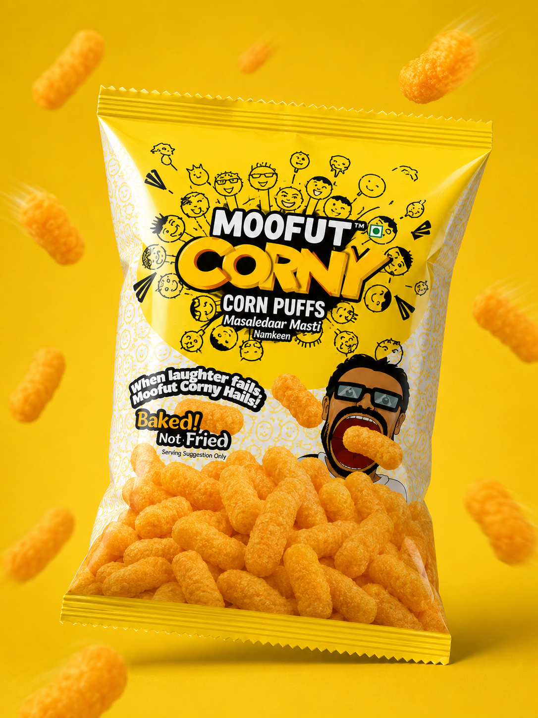
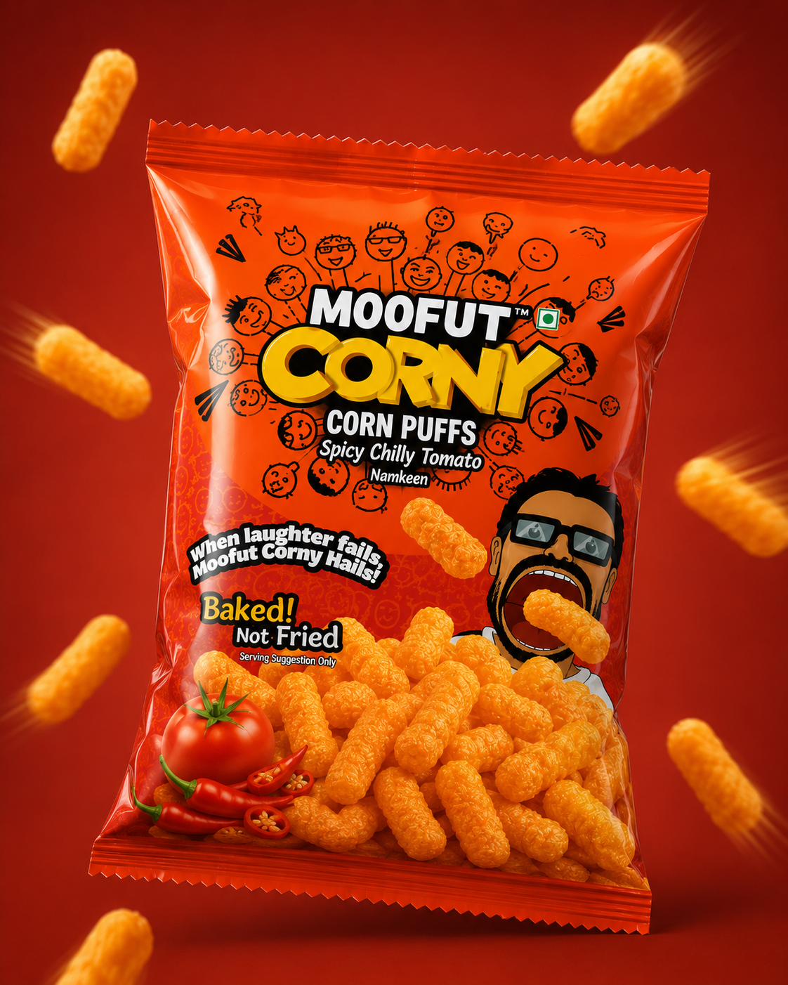
A playful illustrated world of quirky food and snack-inspired doodles was introduced into the background to give Corny its own personality. Rather than relying only on conventional food photography, the illustrations create a youthful, energetic character that supports the humorous brand voice. The product photography then becomes the appetite-driving element at the bottom of the pack, showing the golden baked corn balls in an abundant, tactile presentation.
The communication “Baked! Not Fried” was given prominent visibility, while the line “When laughter fails, Moofut Corny Hails!” adds a memorable and light-hearted personality to the pack.
The back-of-pack was structured with a cleaner information hierarchy, allowing ingredients, nutritional information, allergen information, manufacturer details, licensing information and other regulatory requirements to remain legible without competing with the primary brand communication. The supplied artwork also communicates the product as a ready-to-eat savoury corn puff and carries the required nutritional and manufacturing information.
A playful and high-energy packaging identity designed to make Moofut Corny stand out as a fun, cheesy and contemporary baked snack for the new-age Indian consumer.
03. The Result
The resulting packaging gives Moofut Corny a highly recognisable and character-driven presence within the snack category. The combination of a vivid blue base, bold yellow-orange product cues, expressive illustrations and a strong central logo creates an identity that feels youthful, approachable and energetic.
More importantly, the design creates a clear visual hierarchy between brand, product, flavour and product benefit, allowing the front of the pack to work quickly at shelf level while the reverse accommodates the detailed information required for an FMCG product.
The result is a packaging system that does more than simply contain the product—it gives Corny a distinct personality and creates a visual language that can be extended across future Moofut snack variants.
Impact:
The packaging establishes Moofut Corny as a playful, contemporary snack brand with strong shelf visibility and a memorable visual personality. Its combination of product appetite appeal, humorous communication and structured information design helps bridge the gap between a fun consumer-facing identity and the functional requirements of a packaged food product.