
Moofut Banana Chips
CATEGORY: Food & FMCG
SOFTWARE: Adobe Illustrator, Photoshop
SERVICES: Brand Strategy, Packaging Design, Copywriting
CLIENT: Moofut
01. The Challenge
How do you make a familiar snack category feel instantly memorable?
Banana chips are a familiar product, but the category is crowded with predictable packaging cues, bananas, product photography, bright colours and conventional snack messaging.
The challenge was to create a visual identity that could stand out on the shelf, communicate the product instantly and give the brand a personality of its own.
Rather than competing purely on taste or product claims, the idea was to build the brand around a simple behavioural truth:
You can’t eat just one without losing control.
That thought led us to the idea of “slipping” — a playful connection between the banana itself and the irresistible nature of the snack.
The result needed to feel youthful, irreverent and highly shareable, while still making the product unmistakably recognizable as banana chips.


02. The Solution
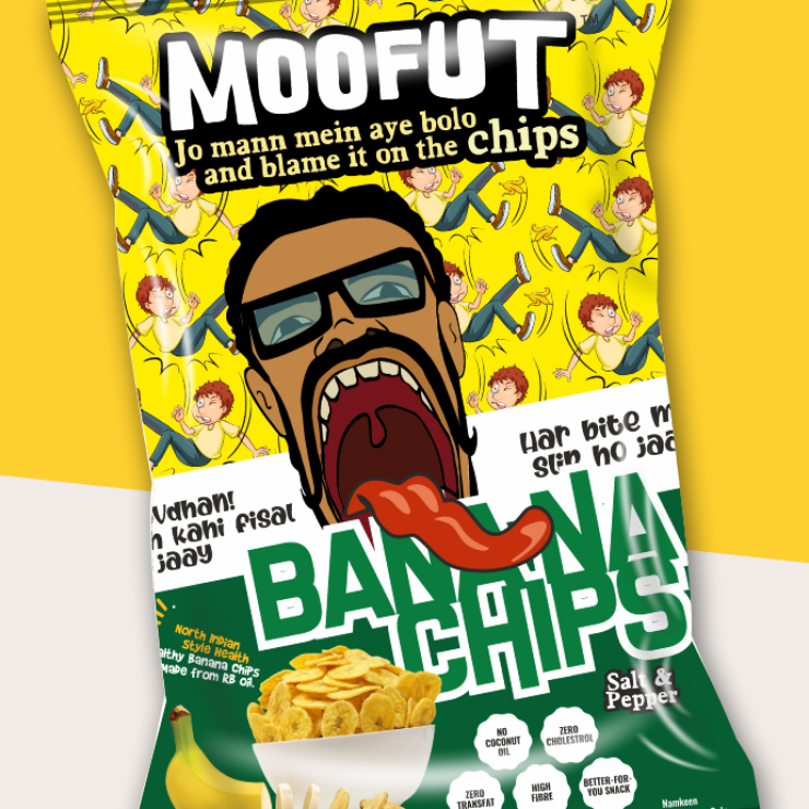
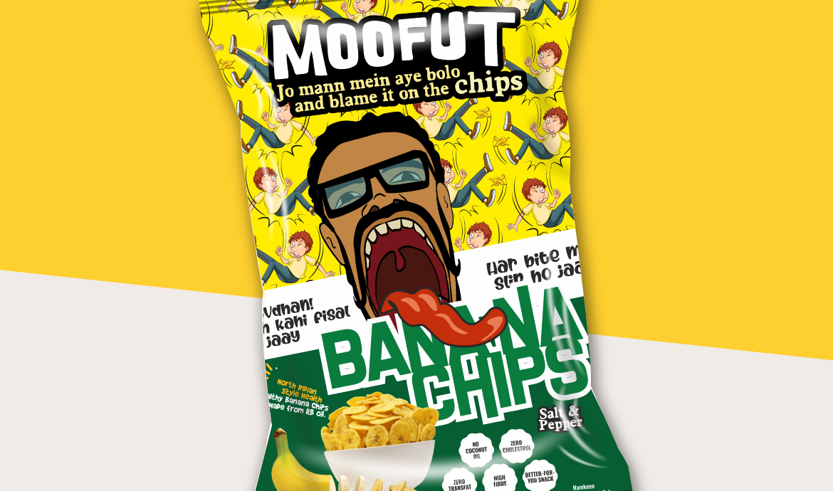
Saavdhaan!! Jubaan kahi fisal na jaay.
We turned the familiar Hindi warning “Saavdhaan!!” into the brand’s central personality.
Instead of warning consumers about something serious, the packaging delivers a humorous warning about something much more tempting:
your tongue might slip.
The visual language combines exaggerated characters, bold typography, banana-led graphics and an intentionally chaotic composition to create a pack that feels energetic and mischievous.
The second line reinforces the idea:
“Har bite mein slip ho jaaye.”
Together, the two lines create a memorable verbal hook while connecting the banana, the act of eating and the idea of losing control into one simple brand world.
The packaging was designed to behave almost like a visual joke, something consumers notice from a distance and discover further when they pick it up.
03. The Result
The final Moofut Banana Chips packaging transforms an everyday snack into a character-driven brand experience.
Instead of relying on conventional “crispy / tasty / delicious” communication, the pack establishes its own vocabulary around slip, bite and irresistible temptation.
The combination of bold illustration, unconventional copy and a distinctive visual personality gives the product strong shelf presence and recall, while making the packaging itself a piece of communication.
Most importantly, the concept creates room for the brand to extend beyond the pack — into social media, campaigns, point-of-sale communication and other brand touchpoints.
Because when the product promises that every bite can make you slip, there is always another story to tell.